
LilitDer Hovanessian
Case Study 1 · Product Evolution
Evolving a complex product into a scalable system
A long-term redesign effort focused on scaling complexity across audits, reporting, dashboards, and compliance workflows.
Product
QAPIplus
Industry
Healthcare / Compliance
Platform
Web (B2B SaaS)
Role
Senior Product Designer (sole designer)
Timeline
Ongoing (multi-year evolution)
Overview
From first version to system-driven product
QAPIplus is a compliance and reporting platform for home health and hospice agencies.
I designed the product from its earliest version through its most recent redesign, evolving it over eight years and across three major iterations. In the latest version, I introduced a design system from scratch and rebuilt the entire experience on top of it.
My role spanned product redesign, system design, and UX for complex, data-heavy workflows. The focus was not just usability, but scaling clarity across audits, reporting, and compliance systems in a fast-moving environment.
Three iterations over eight years of product evolution
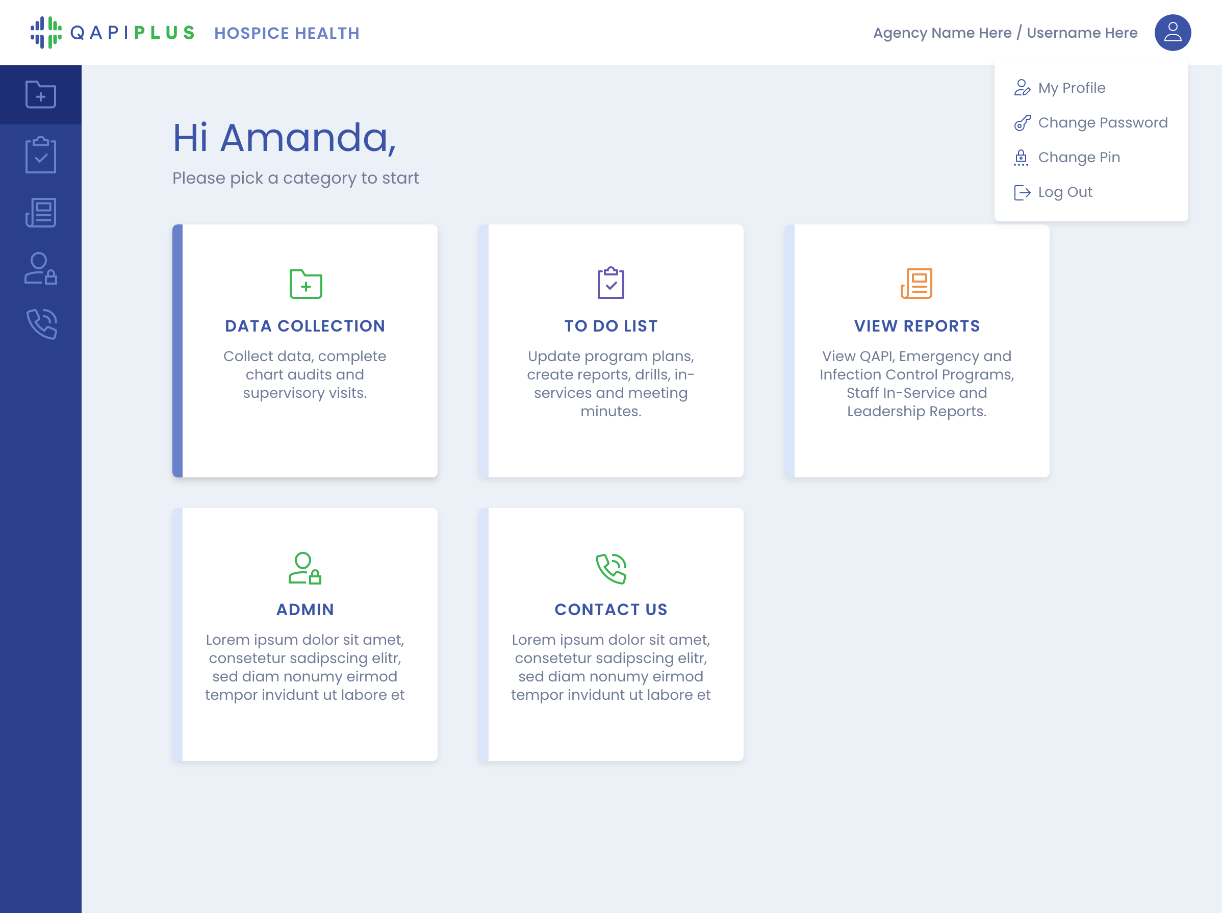
V1 - Foundational product with functional, literal UI
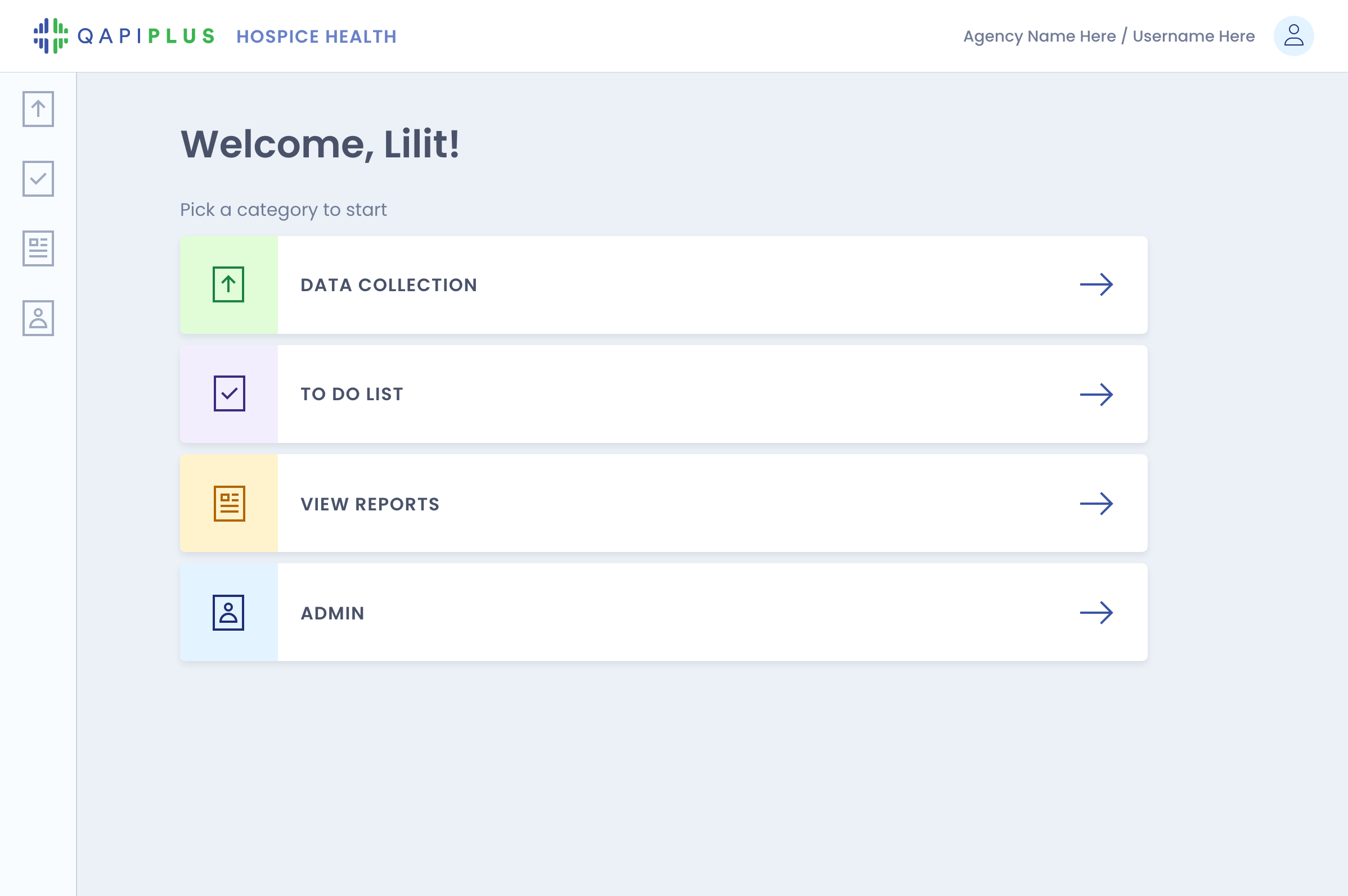
V2 - Simpler, more product-focused interface
V3 - System-driven redesign with structured workflows and patterns
Key workflows across the product
V1 - Form-heavy layout with minimal hierarchy
V2 - Improved organization across workflows
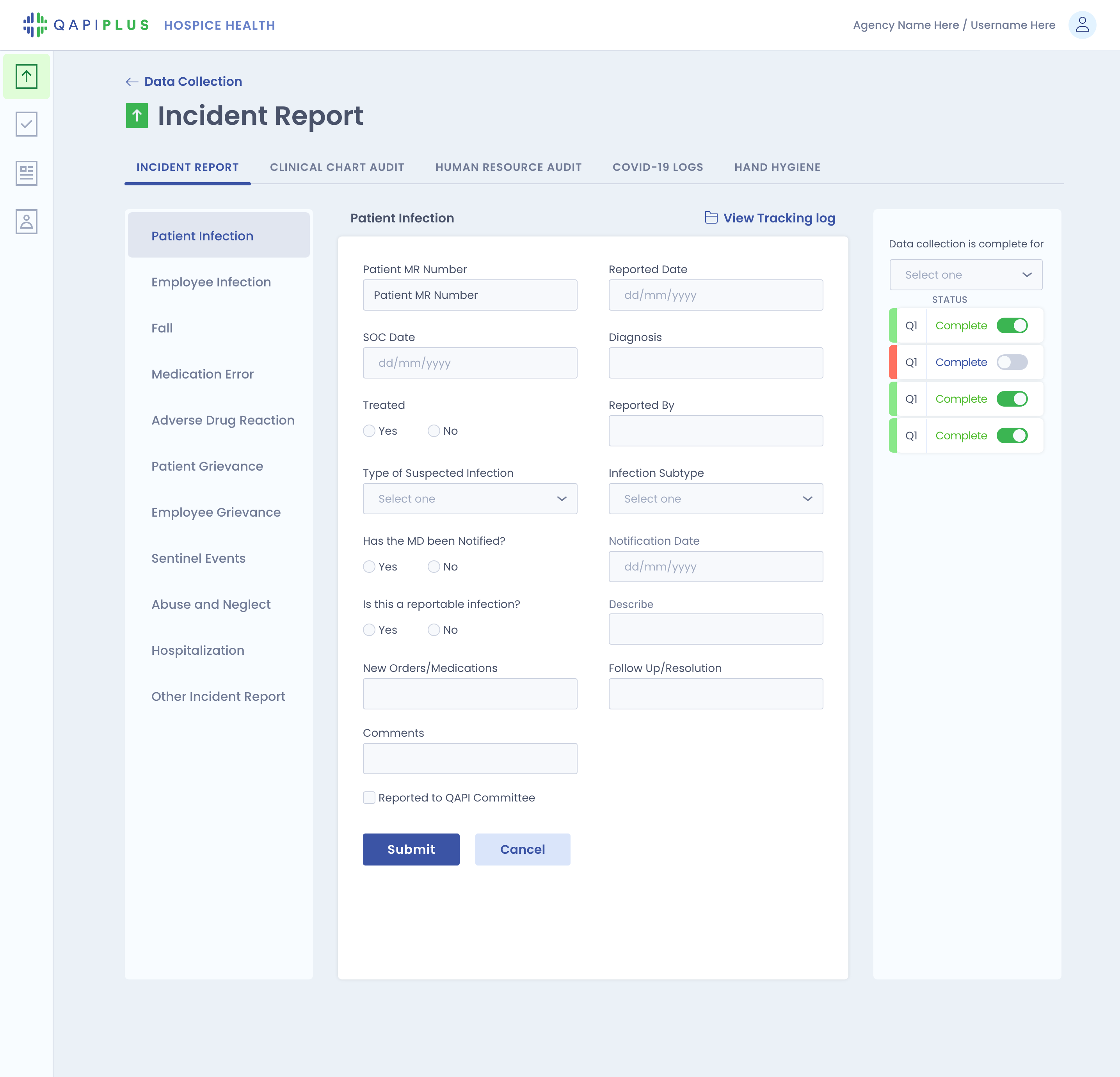
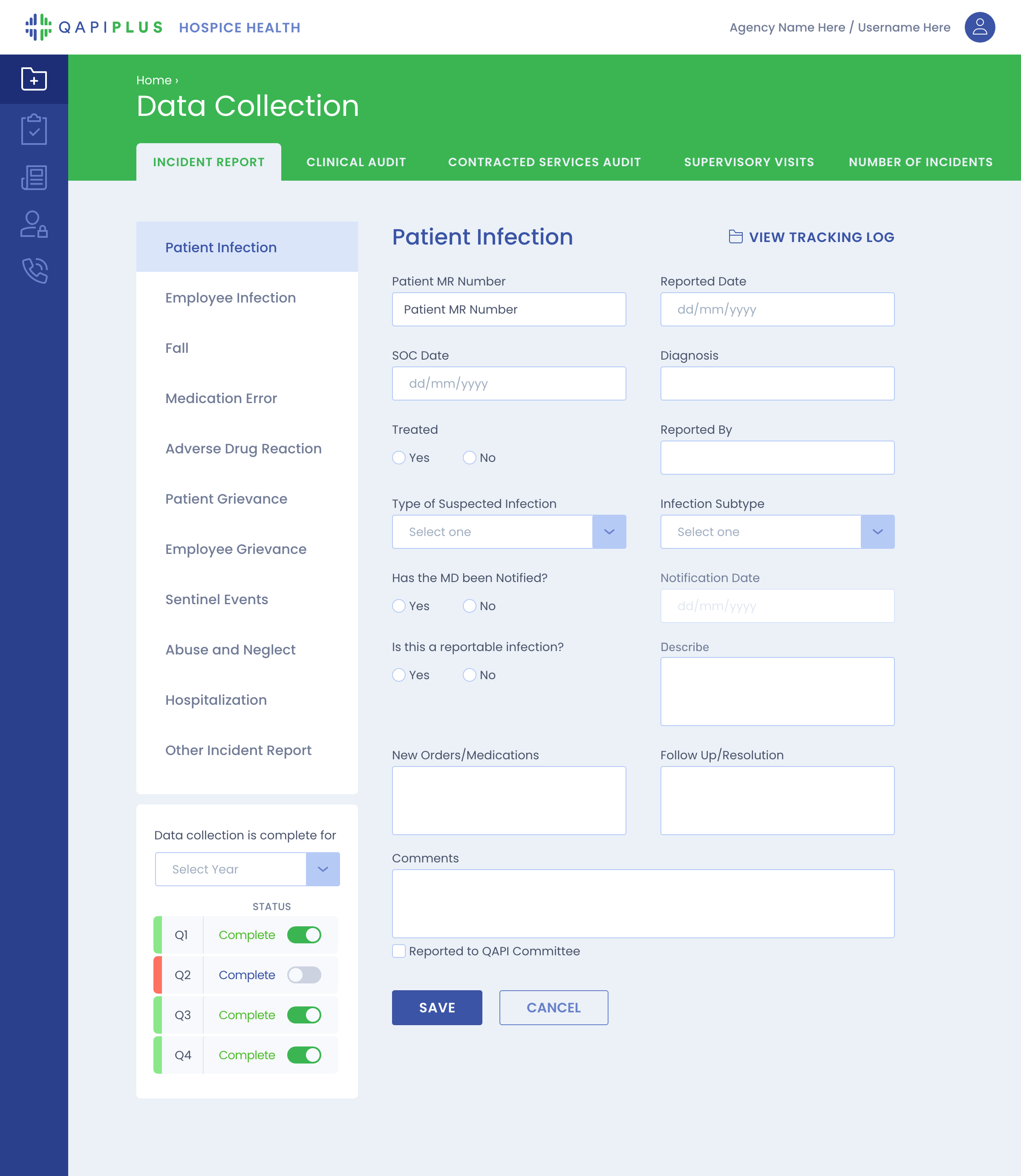
V3 - Structured inputs with clearer hierarchy and flow

01 - The problem
When growth outpaces structure
As the product expanded, complexity grew alongside it.
Data-heavy tables became harder to scan, long pages increased cognitive load, and patterns began to diverge across modules. Without a system in place, many interfaces were built manually, leading to inconsistency over time.
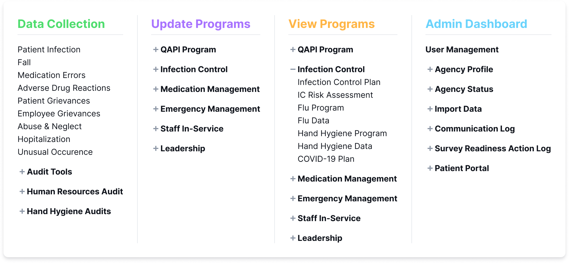
The product continued to grow, but the structure wasn’t keeping up. To address this, I restructured navigation into clearer, grouped workflows that better reflect how the product is used.
Structured navigation with clearer grouping and hierarchy
02 — Understanding & Exploration
From connected workflows to clearer structure
Having worked on the product from the beginning, I understood how workflows evolved across audits, incidents, and reporting.
I mapped these relationships and identified repeated but inconsistent patterns. This led to a shift from designing individual pages to restructuring how information was organized, introducing clearer hierarchy, grouped sections, and reusable patterns across the product.
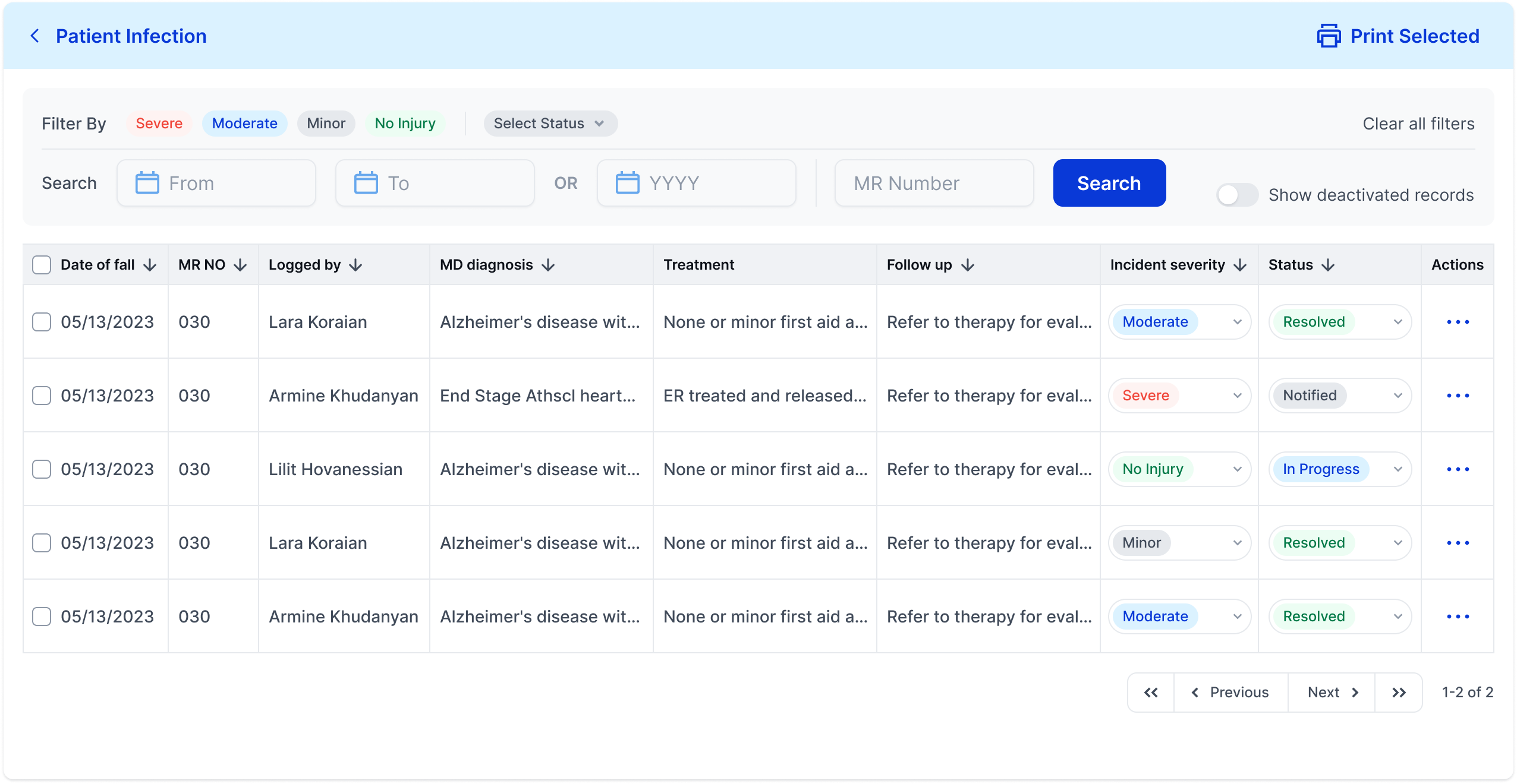
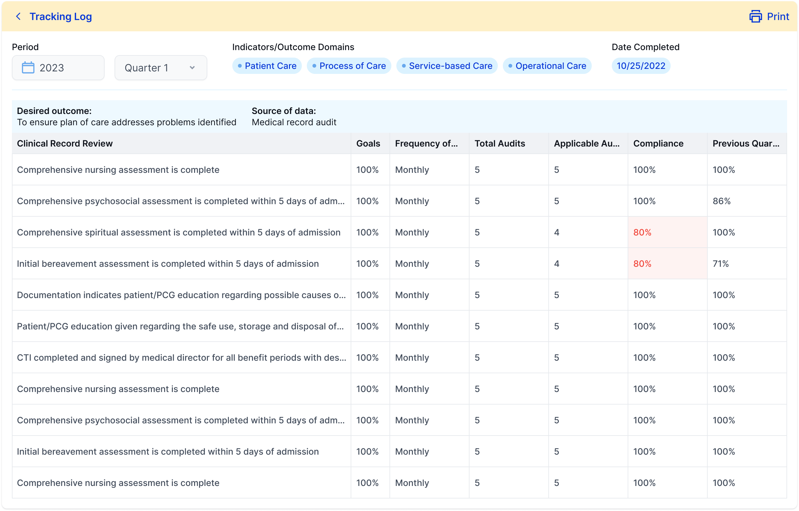
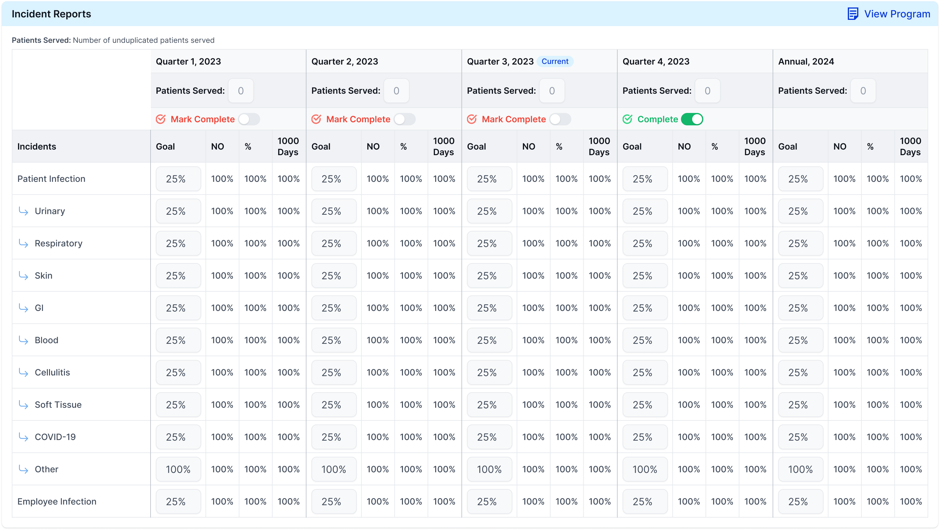
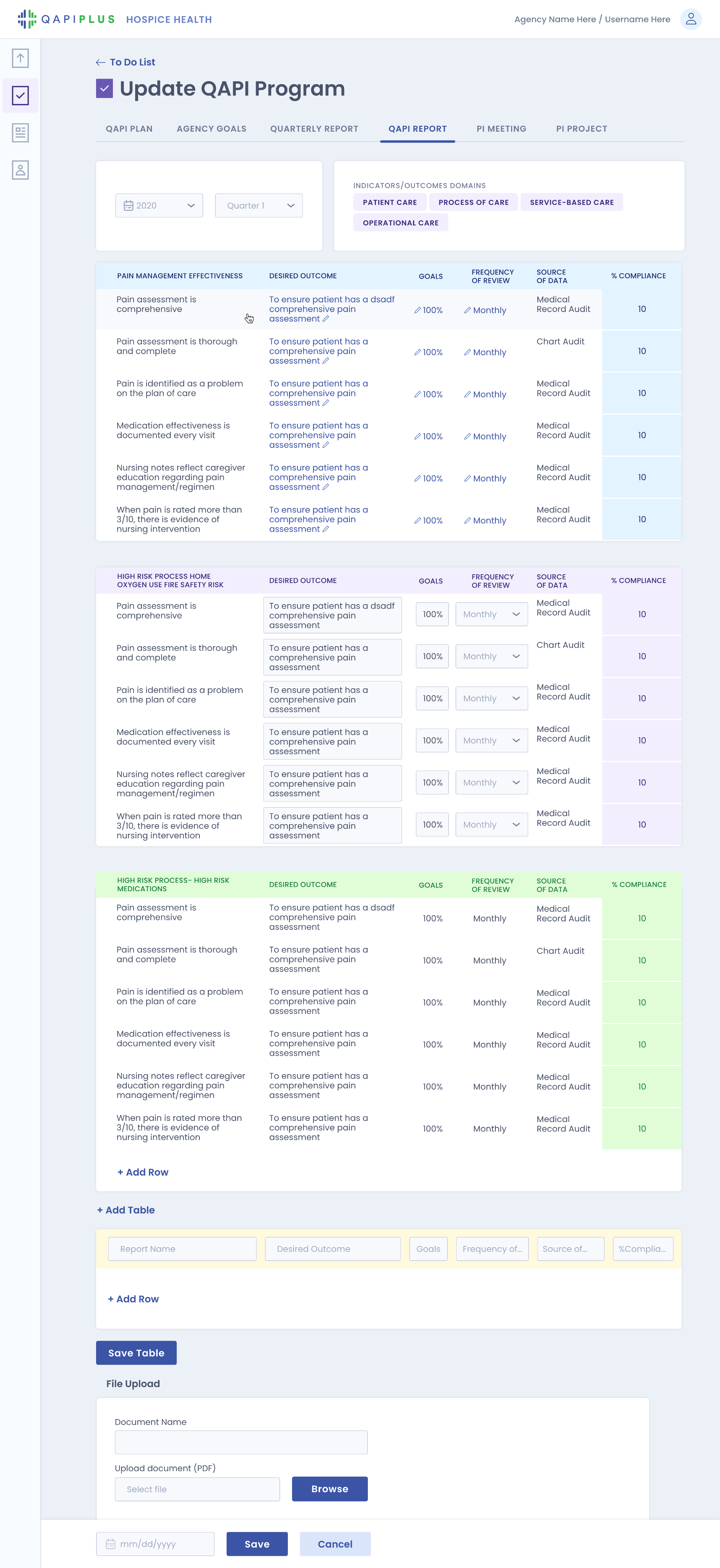
Audits, reports, and tracking logs share similar structures across the product, but were previously inconsistent
Tracking log (Data Collection)
QAPI report (View Reports)
Quarterly report (Update Programs)
03 — System & Iteration
Designing a system within a moving product
The redesign evolved alongside a fast-growing product.
I iterated continuously with stakeholders, adapting to new requirements and real constraints. Edge cases were part of the core experience, especially in compliance workflows.
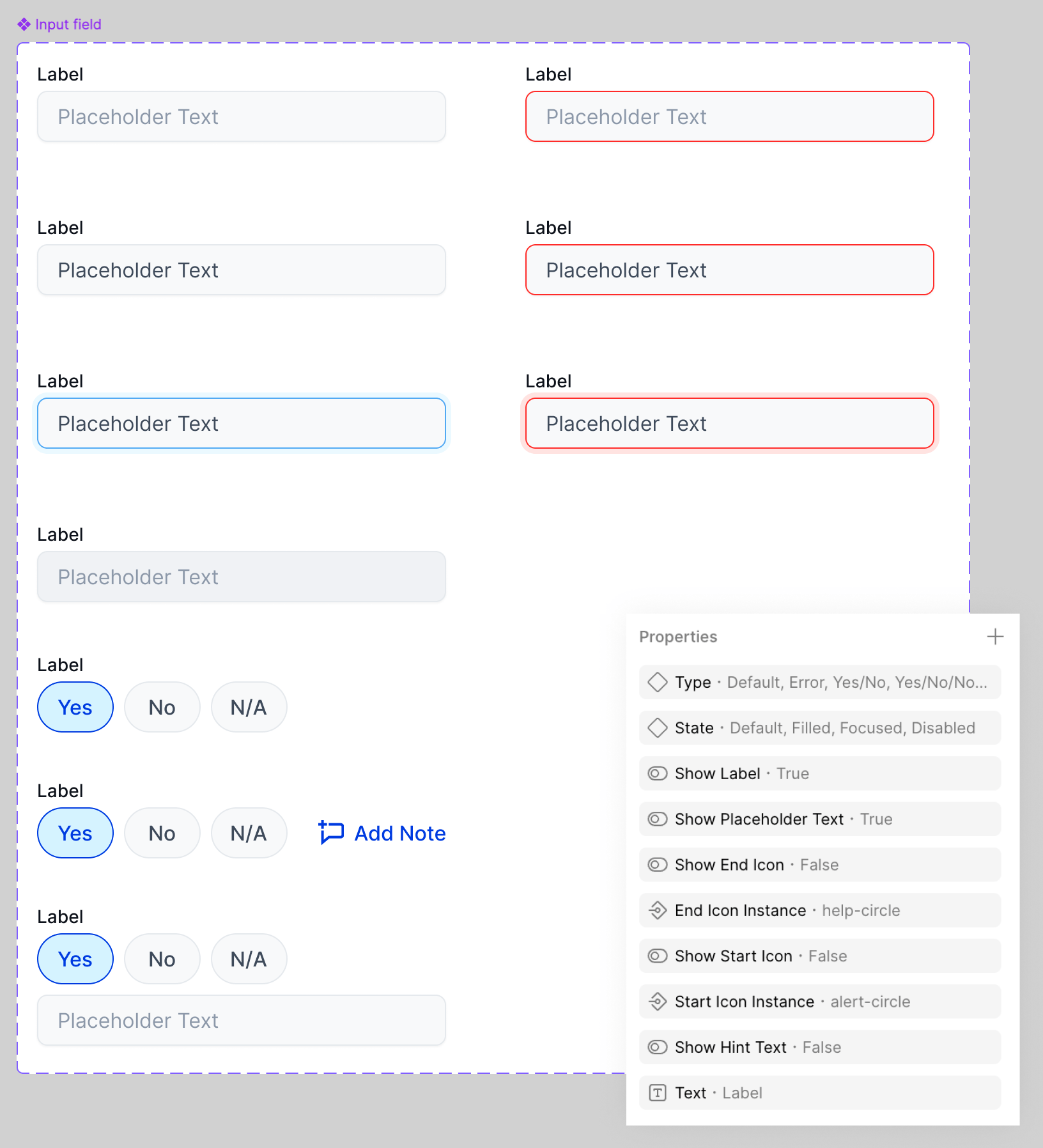
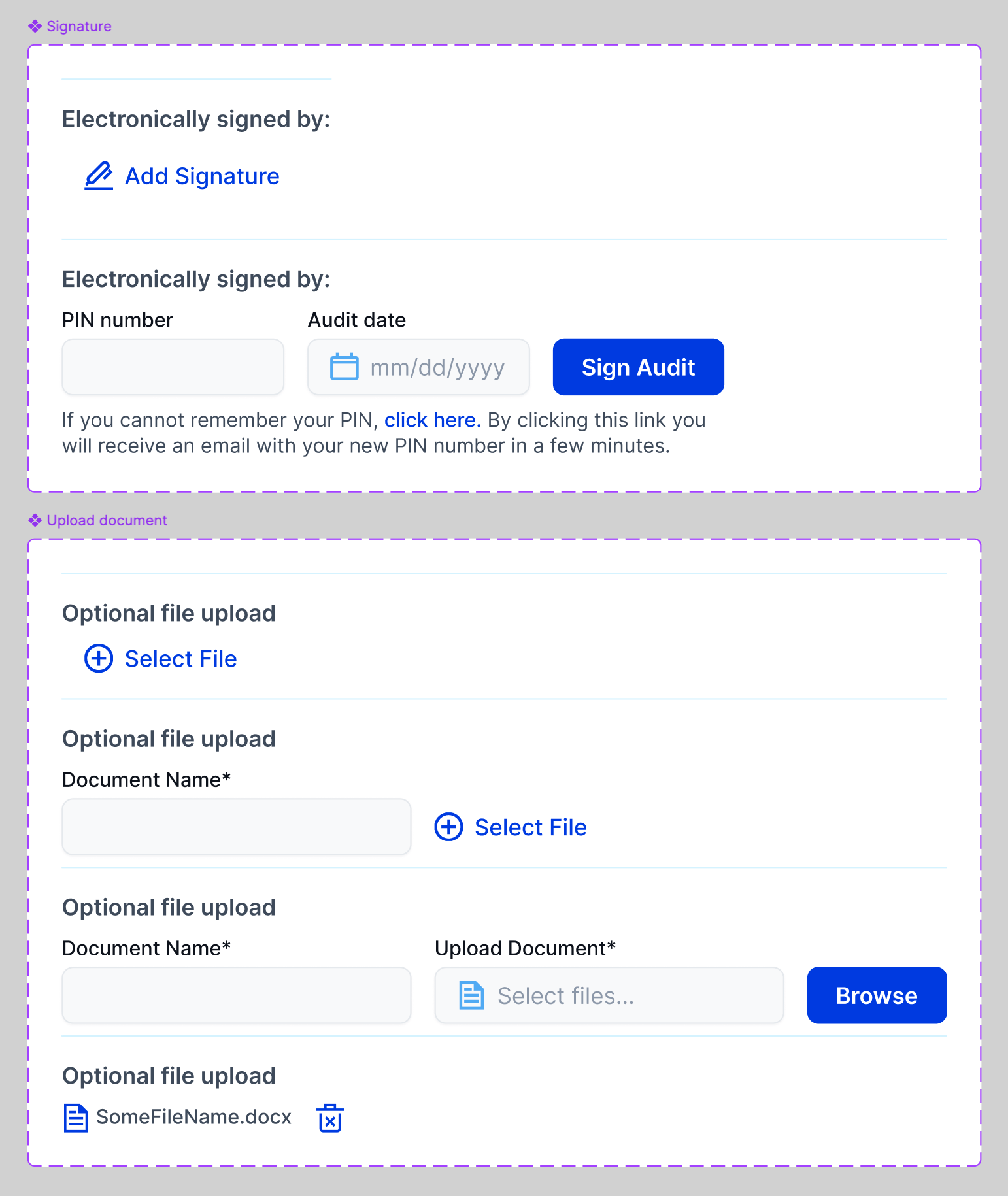
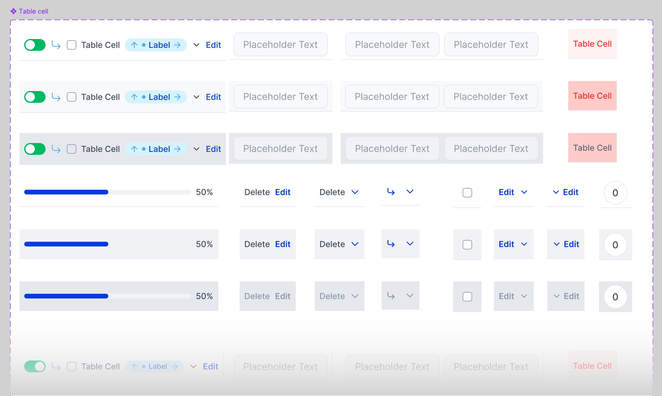
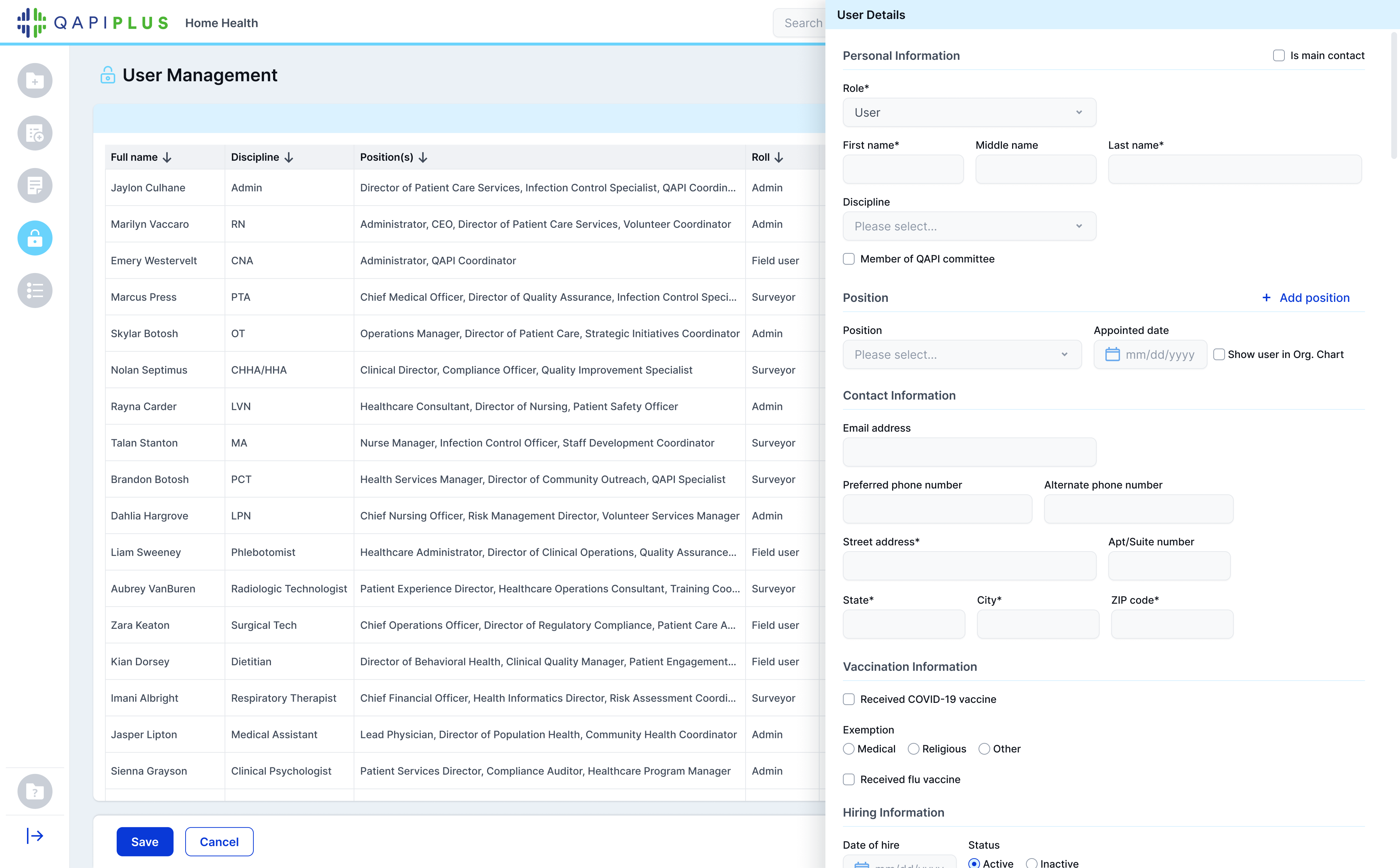
In the third version, I formalized this work into a design system. I created it from scratch and redesigned all pages using it, introducing consistent components, layout rules, and interaction patterns across the product.
This shifted the product from a collection of screens into a scalable system.
Reusable patterns across the product
04 — Transformation
Introducing Structure to Data-Dense Workflows
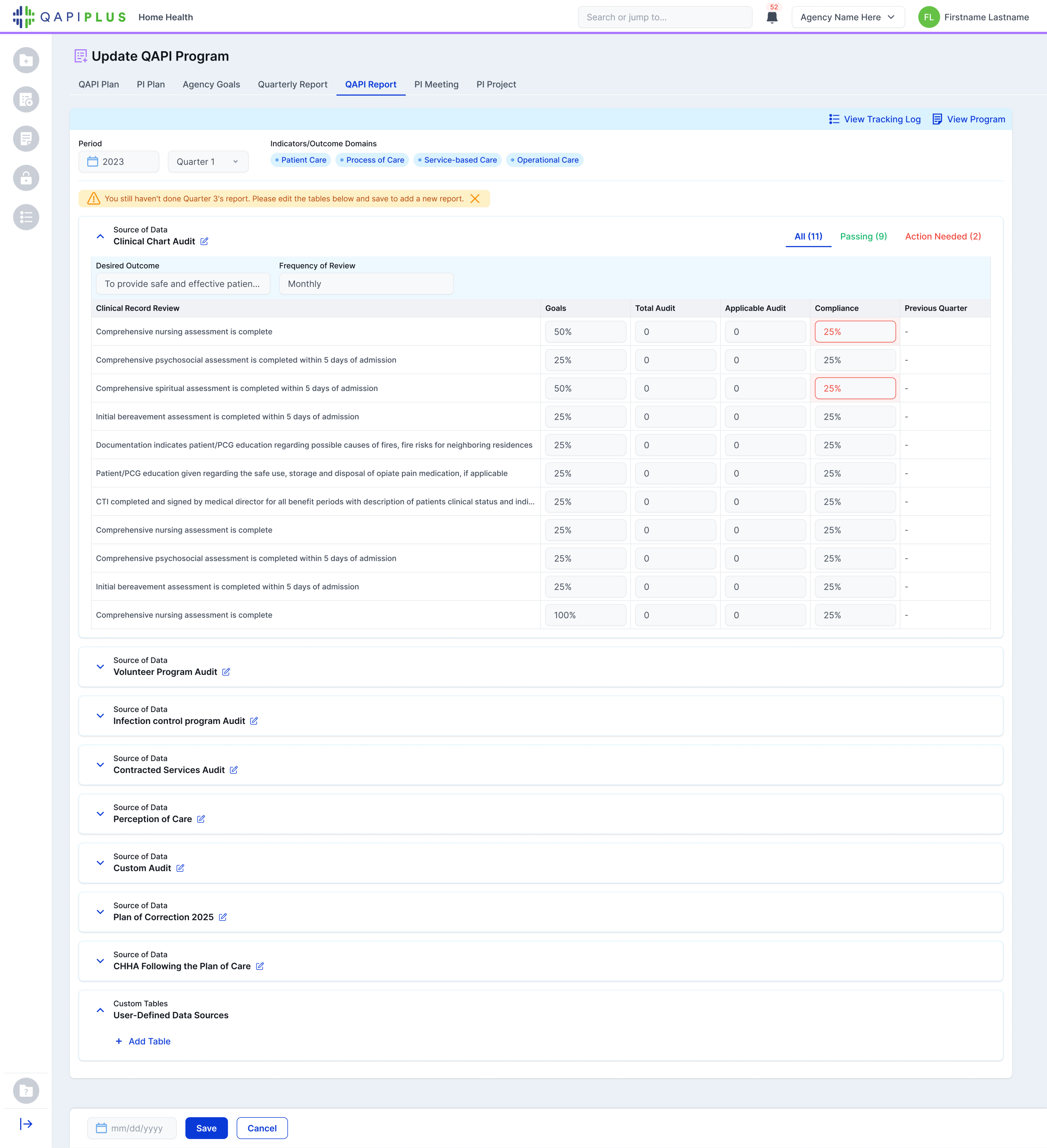
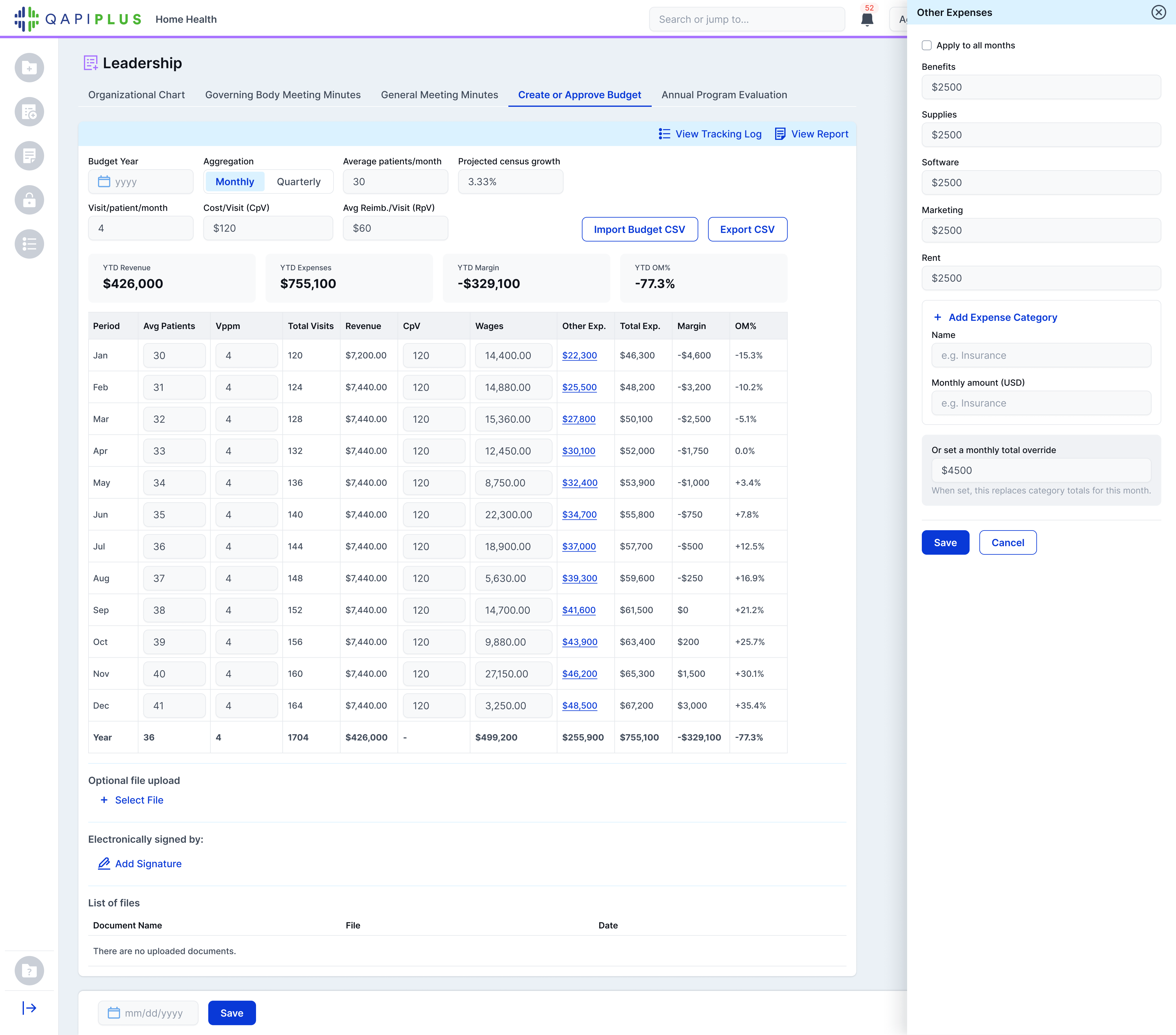
The experience shifted from long, linear pages to structured workflows.
Tables were reorganized, hierarchy was clarified, and visual noise was reduced. Users could move through information more intentionally, focusing on what mattered.
Data-heavy tables paired with in-context editing via drawer, allowing users to review and update information without leaving the page
Before
After - Collapsible sections, clearer hierarchy, and structured data grouping
Outcome
A system designed to support complexity, without overwhelming it
The redesign improved clarity, consistency, and scalability across the product.
Users can now navigate complex data more easily, with clearer structure and reduced cognitive load. Workflows feel more predictable across modules, making the product easier to use and extend.
By introducing a design system and rebuilding the product on top of it, the experience shifted from something that had grown organically to one intentionally structured for continued evolution.
In-context editing via drawer

© 2026 – Lilit Der Hovanessian
Lilit Der Hovanessian
Case Study 1 · Product Evolution
Evolving a complex product into a scalable system
A long-term redesign effort focused on scaling complexity across audits, reporting, dashboards, and compliance workflows.
Product
QAPIplus
Industry
Healthcare / Compliance
Platform
Web (B2B SaaS)
Role
Senior Product Designer (sole designer)
Timeline
Ongoing (multi-year evolution)
Overview
From first version to system-driven product
QAPIplus is a compliance and reporting platform for home health and hospice agencies.
I designed the product from its earliest version through its most recent redesign, evolving it over eight years and across three major iterations. In the latest version, I introduced a design system from scratch and rebuilt the entire experience on top of it.
My role spanned product redesign, system design, and UX for complex, data-heavy workflows. The focus was not just usability, but scaling clarity across audits, reporting, and compliance systems in a fast-moving environment.
Three iterations over eight years of product evolution
V1 - Foundational product with functional, literal UI
V2 - Simpler, more product-focused interface
V3 - System-driven redesign with structured workflows and patterns
Key workflows across the product
V1 - Form-heavy layout with minimal hierarchy
V2 - Improved organization across workflows
V3 - Structured inputs with clearer hierarchy and flow
01 - The problem
When growth outpaces structure
As the product expanded, complexity grew alongside it.
Data-heavy tables became harder to scan, long pages increased cognitive load, and patterns began to diverge across modules. Without a system in place, many interfaces were built manually, leading to inconsistency over time.
The product continued to grow, but the structure wasn’t keeping up. To address this, I restructured navigation into clearer, grouped workflows that better reflect how the product is used.
Structured navigation with clearer grouping and hierarchy
02 — Understanding & Exploration
From connected workflows to clearer structure
Having worked on the product from the beginning, I understood how workflows evolved across audits, incidents, and reporting.
I mapped these relationships and identified repeated but inconsistent patterns. This led to a shift from designing individual pages to restructuring how information was organized, introducing clearer hierarchy, grouped sections, and reusable patterns across the product.
Audits, reports, and tracking logs share similar structures across the product, but were previously inconsistent
Tracking log (Data Collection)
QAPI report (View Reports)
Quarterly report (Update Programs)
03 — System & Iteration
Designing a system within a moving product
The redesign evolved alongside a fast-growing product.
I iterated continuously with stakeholders, adapting to new requirements and real constraints. Edge cases were part of the core experience, especially in compliance workflows.
In the third version, I formalized this work into a design system. I created it from scratch and redesigned all pages using it, introducing consistent components, layout rules, and interaction patterns across the product.
This shifted the product from a collection of screens into a scalable system.
Reusable patterns across the product
04 — Transformation
Introducing Structure to Data-Dense Workflows
The experience shifted from long, linear pages to structured workflows.
Tables were reorganized, hierarchy was clarified, and visual noise was reduced. Users could move through information more intentionally, focusing on what mattered.
Before
After - Collapsible sections, clearer hierarchy, and structured data grouping
Data-heavy tables paired with in-context editing via drawer, allowing users to review and update information without leaving the page
Outcome
A system designed to support complexity, without overwhelming it
The redesign improved clarity, consistency, and scalability across the product.
Users can now navigate complex data more easily, with clearer structure and reduced cognitive load. Workflows feel more predictable across modules, making the product easier to use and extend.
By introducing a design system and rebuilding the product on top of it, the experience shifted from something that had grown organically to one intentionally structured for continued evolution.
In-context editing via drawer

© 2026 – Lilit Der Hovanessian