
LilitDer Hovanessian
Case Study 3 · Designing QAPIplus for the Field
Rethinking QAPI Workflows for Mobile Use
A mobile-first redesign focused on transforming complex desktop workflows into streamlined, in-the-moment experiences for incident reporting, audits, and task management.
Product
QAPIplus Mobile
Industry
Healthcare / Compliance
Platform
Mobile (iOS & Android)
Role
Senior Product Designer (sole designer)
Focus
Mobile UX, workflow simplification, field usability, interaction design
Overview
Designing compliance workflows for the realities of the field
QAPIplus workflows were originally built for desktop use, where audits, reporting, and task management happen in more structured settings. In practice, many of these actions take place in the field, where time is limited and attention is divided.
This redesign focused on adapting complex workflows into a mobile experience that supports quick input, clear navigation, and confident action in real time.
The Challenge
- Desktop workflows were too heavy for mobile use
- Data-heavy interfaces didn’t scale to smaller screens
- Users needed to act quickly, not navigate deeply
- Key actions (reporting, audits, tasks) required too many steps
The Approach
- Identified high-frequency, field-based actions
- Reduced workflows to essential steps
- Introduced mobile-native patterns (cards, progressive disclosure)
- Prioritized speed, clarity, and quick decision-making
Key Workflows
Turning the dashboard into a space for action
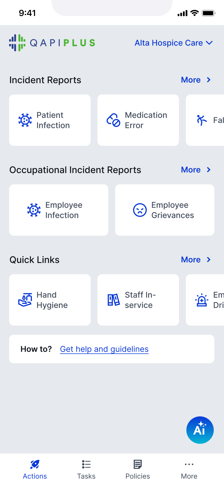
The dashboard shifts from a data overview to a space for action
Key actions are accessible without navigating deep into the system

Tasks are surfaced as scannable cards with priority, due dates, and status
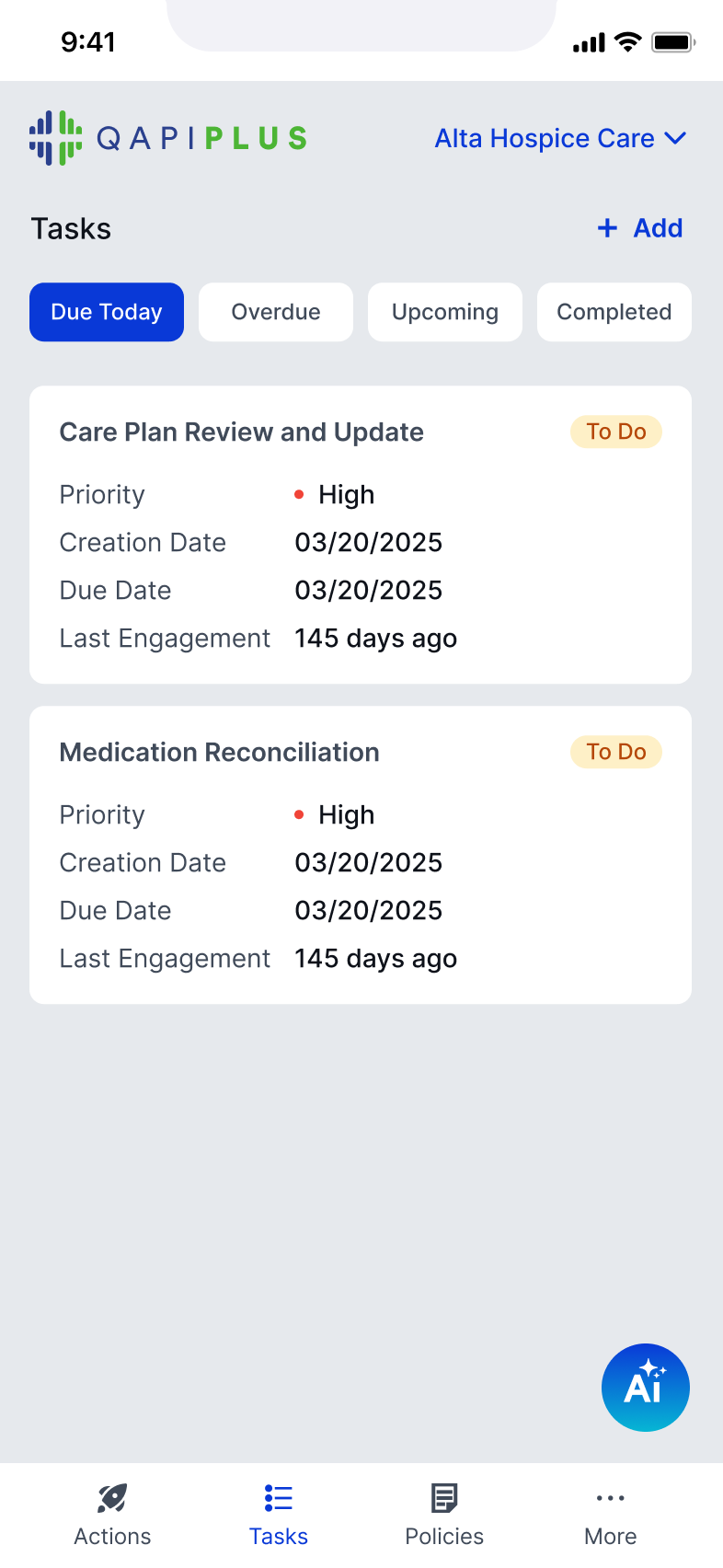
Filters like Due Today, Overdue, Upcoming help users quickly focus

Users can immediately act instead of browsing
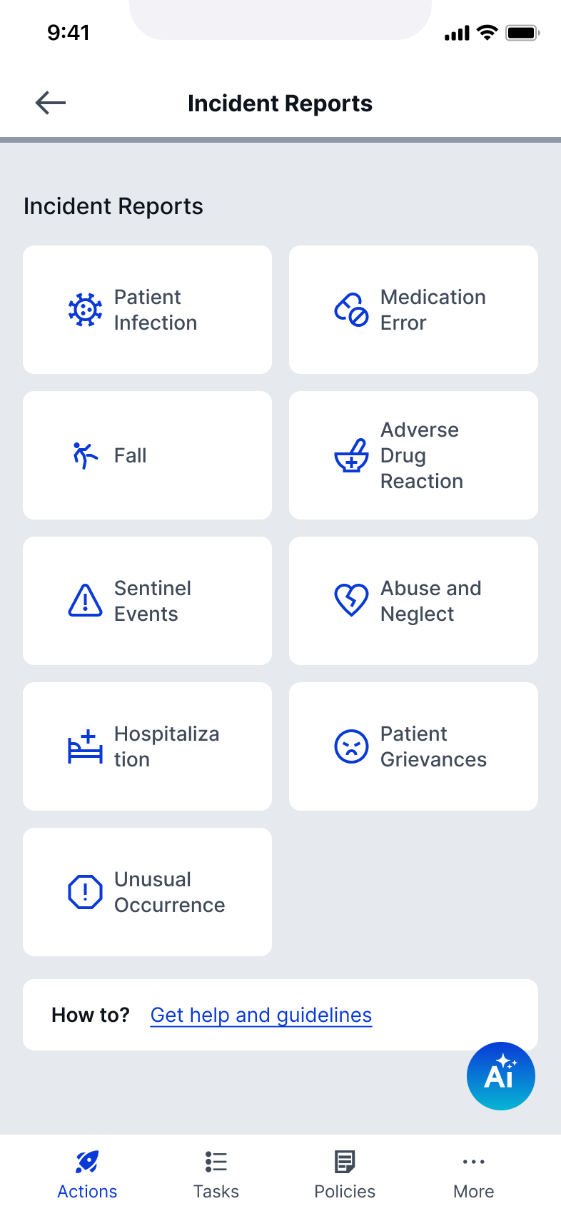
Simplifying incident reporting for real-time input
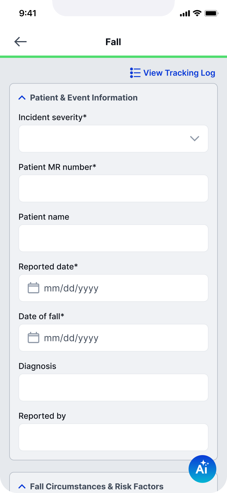
Inputs are grouped and simplified for quick entry
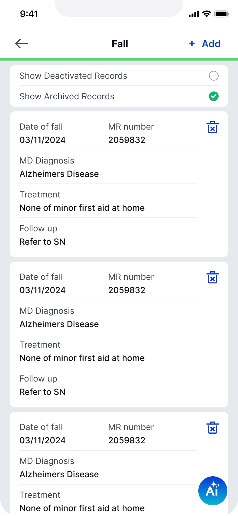
Tracking logs are transformed into card-based, scannable records
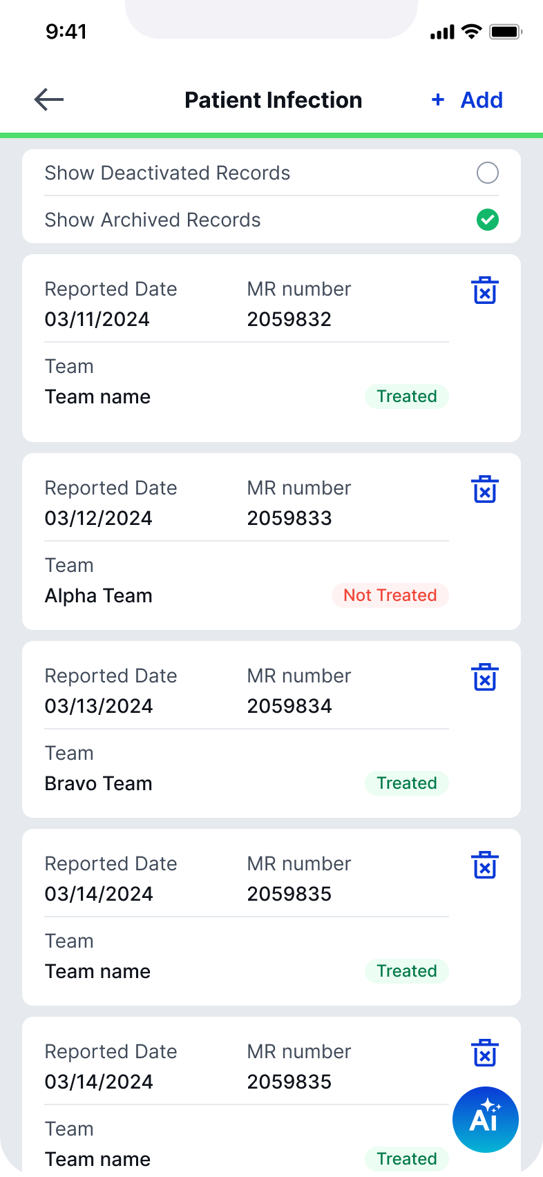
Status indicators (treated / not treated) provide immediate clarity
Incident reporting was redesigned from a long desktop form into a focused, mobile-friendly flow

Capture critical data quickly and accurately in the moment
Making complex documentation easier to navigate
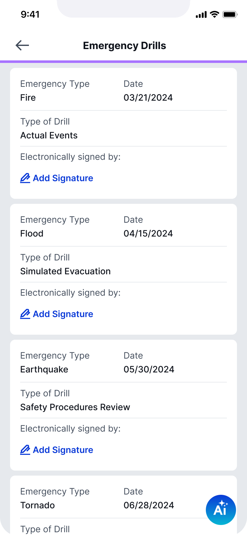
Complex documentation was restructured using expandable sections
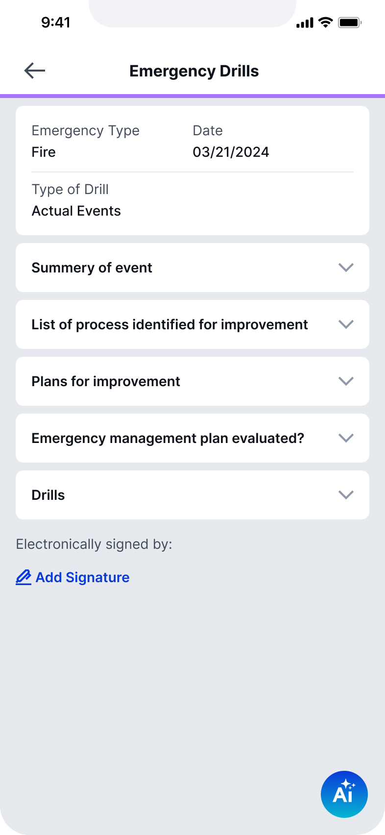
Long-form content is collapsed into digestible blocks so users can expand only what’s needed
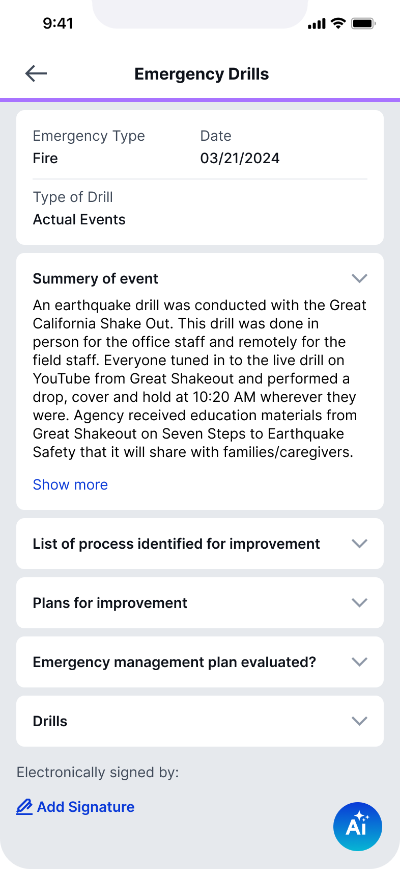
Structured summaries improve readability
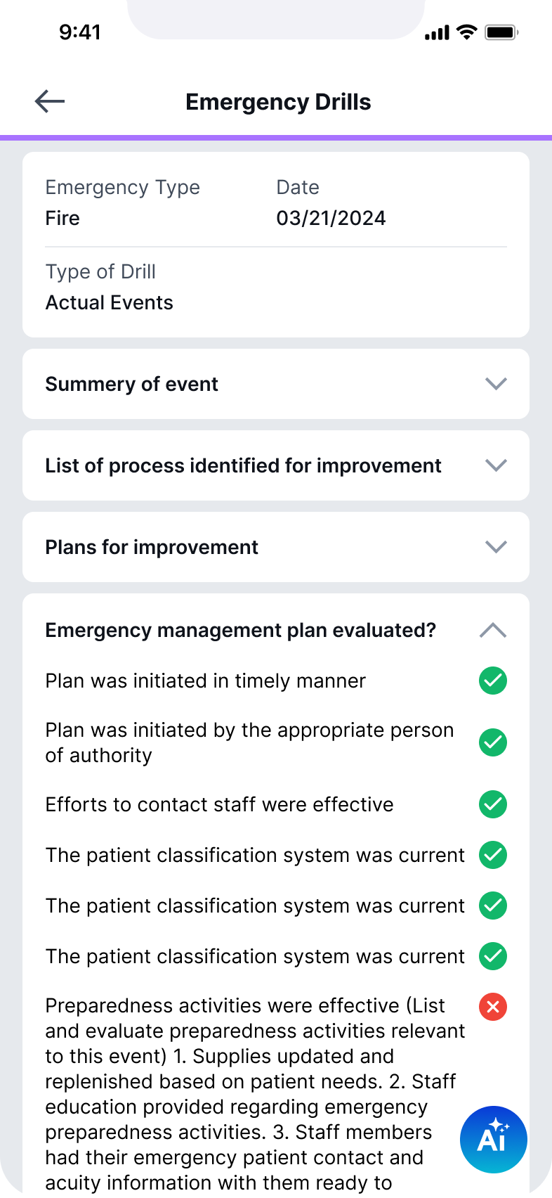
Evaluation states are clearly surfaced with visual indicators
Large amounts of information become navigable, not overwhelming
By focusing on the most critical workflows, the redesign enables faster and more confident action in the field. Simplified interactions and clearer structure reduce friction across reporting, tasks, and documentation, while reinforcing a consistent system that can scale across the product.

© 2026 – Lilit Der Hovanessian
Lilit Der Hovanessian
Case Study 3 · Designing QAPIplus for the Field
Rethinking QAPI Workflows for Mobile Use
A mobile-first redesign focused on transforming complex desktop workflows into streamlined, in-the-moment experiences for incident reporting, audits, and task management.
Product
QAPIplus Mobile
Industry
Healthcare / Compliance
Platform
Mobile (iOS & Android)
Role
Senior Product Designer (sole designer)
Focus
Mobile UX, workflow simplification, field usability, interaction design
Overview
Designing compliance workflows for the realities of the field
QAPIplus workflows were originally built for desktop use, where audits, reporting, and task management happen in more structured settings. In practice, many of these actions take place in the field, where time is limited and attention is divided.
This redesign focused on adapting complex workflows into a mobile experience that supports quick input, clear navigation, and confident action in real time.
The Challenge
- Desktop workflows were too heavy for mobile use
- Data-heavy interfaces didn’t scale to smaller screens
- Users needed to act quickly, not navigate deeply
- Key actions (reporting, audits, tasks) required too many steps
The Approach
- Identified high-frequency, field-based actions
- Reduced workflows to essential steps
- Introduced mobile-native patterns (cards, progressive disclosure)
- Prioritized speed, clarity, and quick decision-making
Key Workflows
Turning the dashboard into a space for action
The dashboard shifts from a data overview to a space for action
Key actions are accessible without navigating deep into the system
Tasks are surfaced as scannable cards with priority, due dates, and status
Filters like Due Today, Overdue, Upcoming help users quickly focus

Users can immediately act instead of browsing
Simplifying incident reporting for real-time input
Inputs are grouped and simplified for quick entry
Tracking logs are transformed into card-based, scannable records
Status indicators (treated / not treated) provide immediate clarity
Incident reporting was redesigned from a long desktop form into a focused, mobile-friendly flow

Capture critical data quickly and accurately in the moment
Making complex documentation easier to navigate
Complex documentation was restructured using expandable sections
Long-form content is collapsed into digestible blocks so users can expand only what’s needed
Structured summaries improve readability
Evaluation states are clearly surfaced with visual indicators
Large amounts of information become navigable, not overwhelming
By focusing on the most critical workflows, the redesign enables faster and more confident action in the field. Simplified interactions and clearer structure reduce friction across reporting, tasks, and documentation, while reinforcing a consistent system that can scale across the product.

© 2026 – Lilit Der Hovanessian